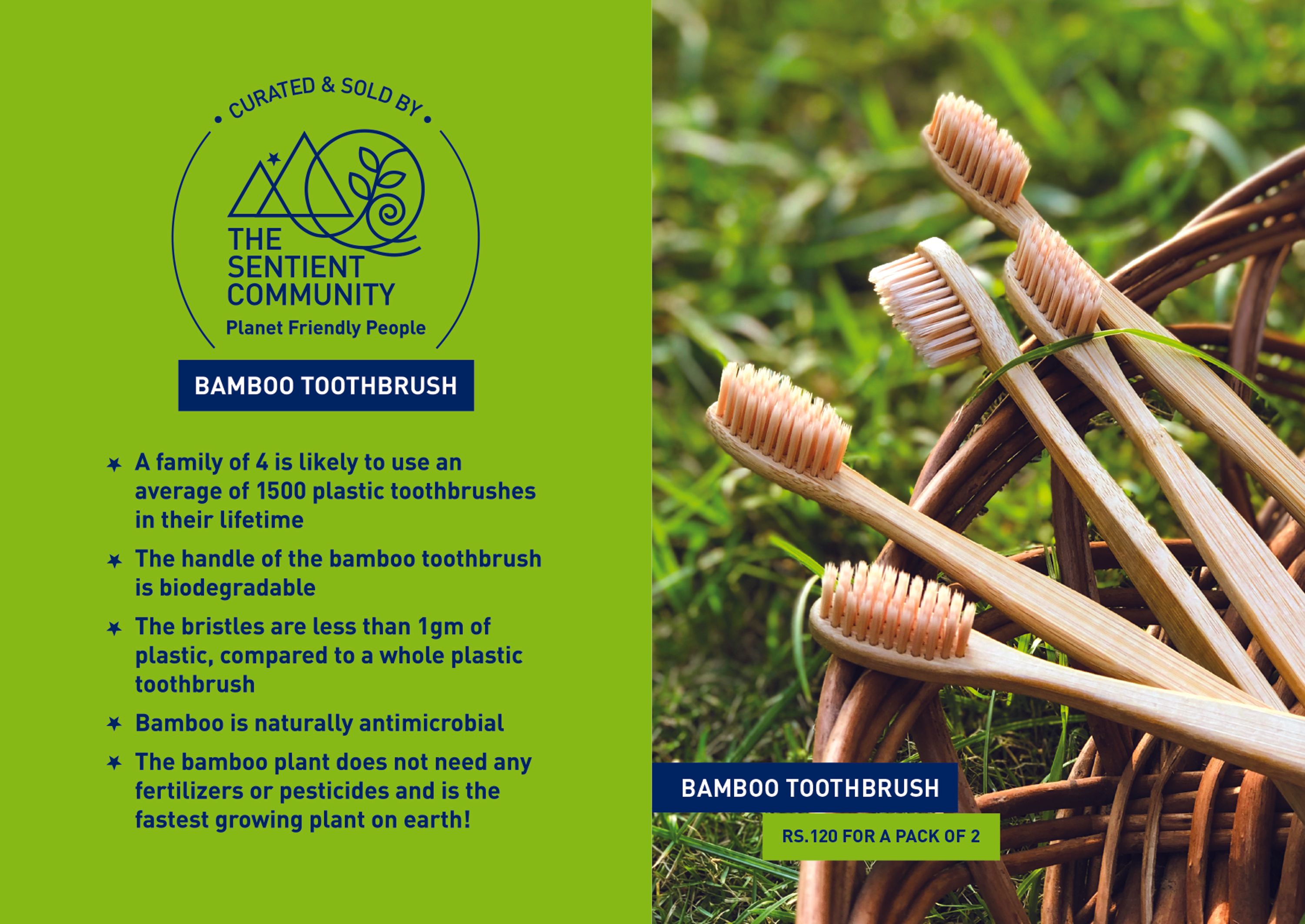
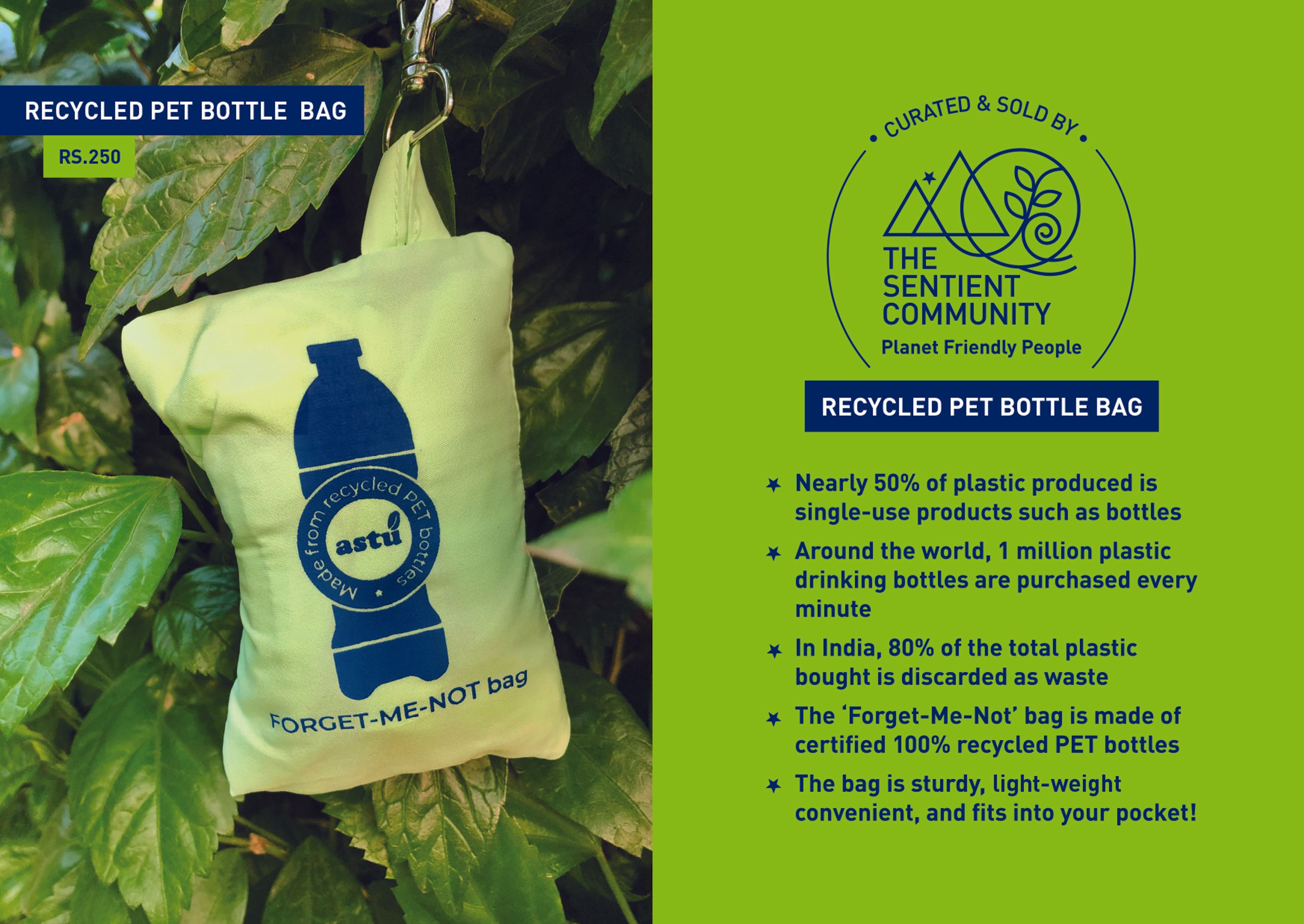
Brief: The Sentient Community is a start-up that creates awareness about each individual doing their bit for the environment, and is a market place that curates and sells eco-friendly products. The word ‘sentient’ means ‘being sensitive to’ and ‘conscious of.’ The founders wanted the visual identity to reflect this ethos.
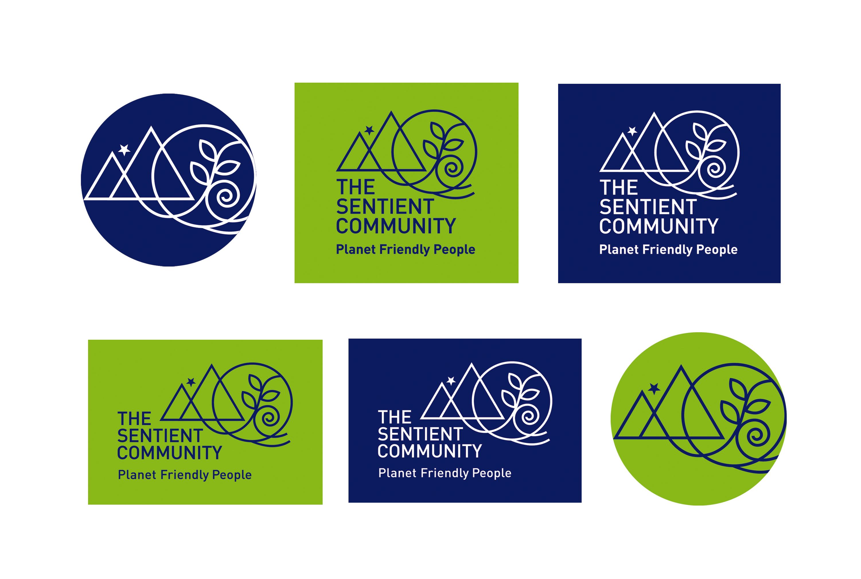
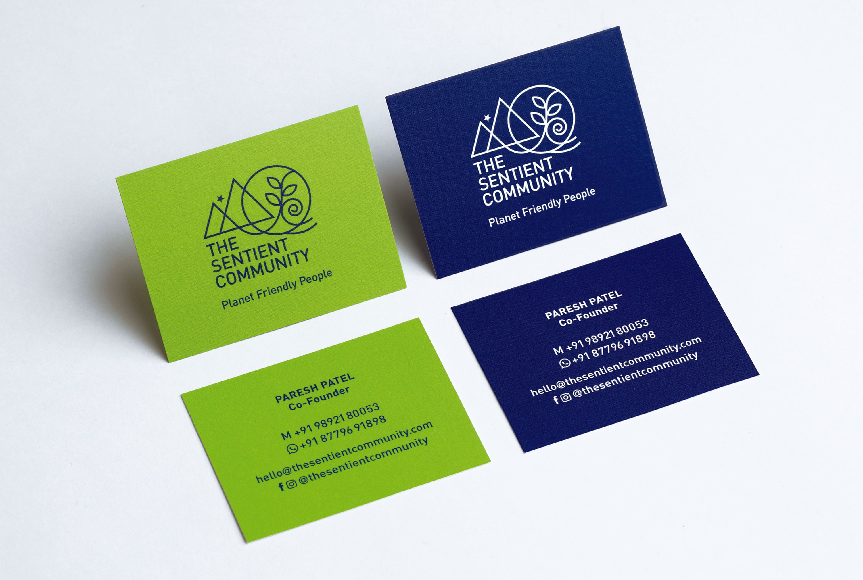
Logo Concept: The elements of nature are intertwined in a delicate balance to form the symbol in the line-drawing style. It symbolises the delicate balance between human beings and nature. The triangular pyramid shape also symbolises the ability to reach a higher level of consciousness. The logo lends itself well to variable usage by moving the symbol, wordmark and baseline around.
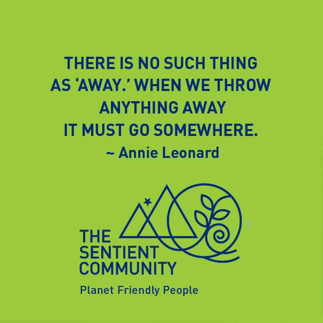
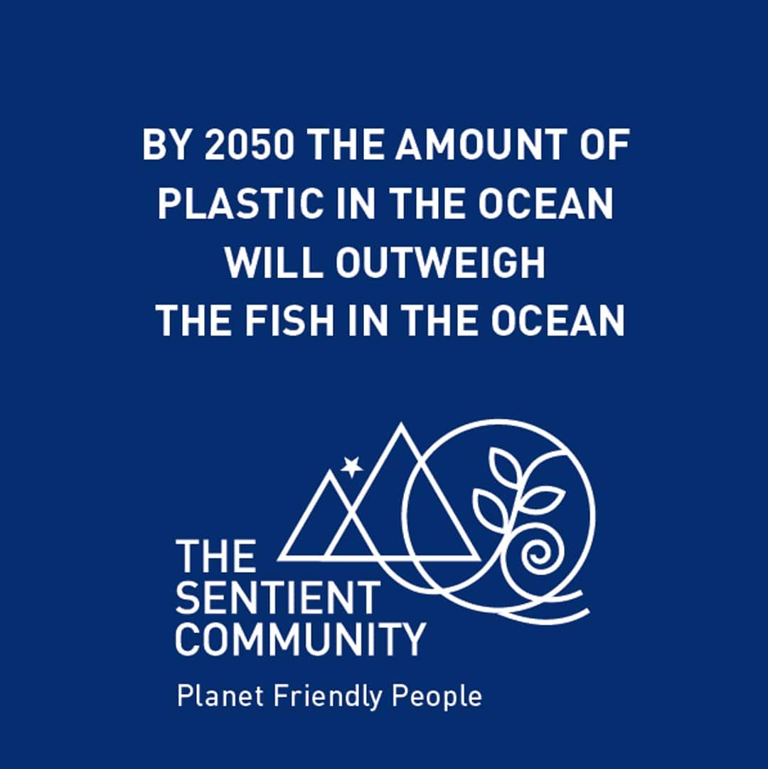
Overall Concept: The community consists of producers of sustainable products and individuals who are sensitive towards the environment and are ready to make simple changes in their everyday purchases. We positioned the brand as ‘planet friendly people’ where the startup encourages consumers to ’just do their bit’ for the environment rather than expecting only governments and corporations to act. Being a solution-based, optimistic brand, a bright color palette of the land and the oceans was picked.