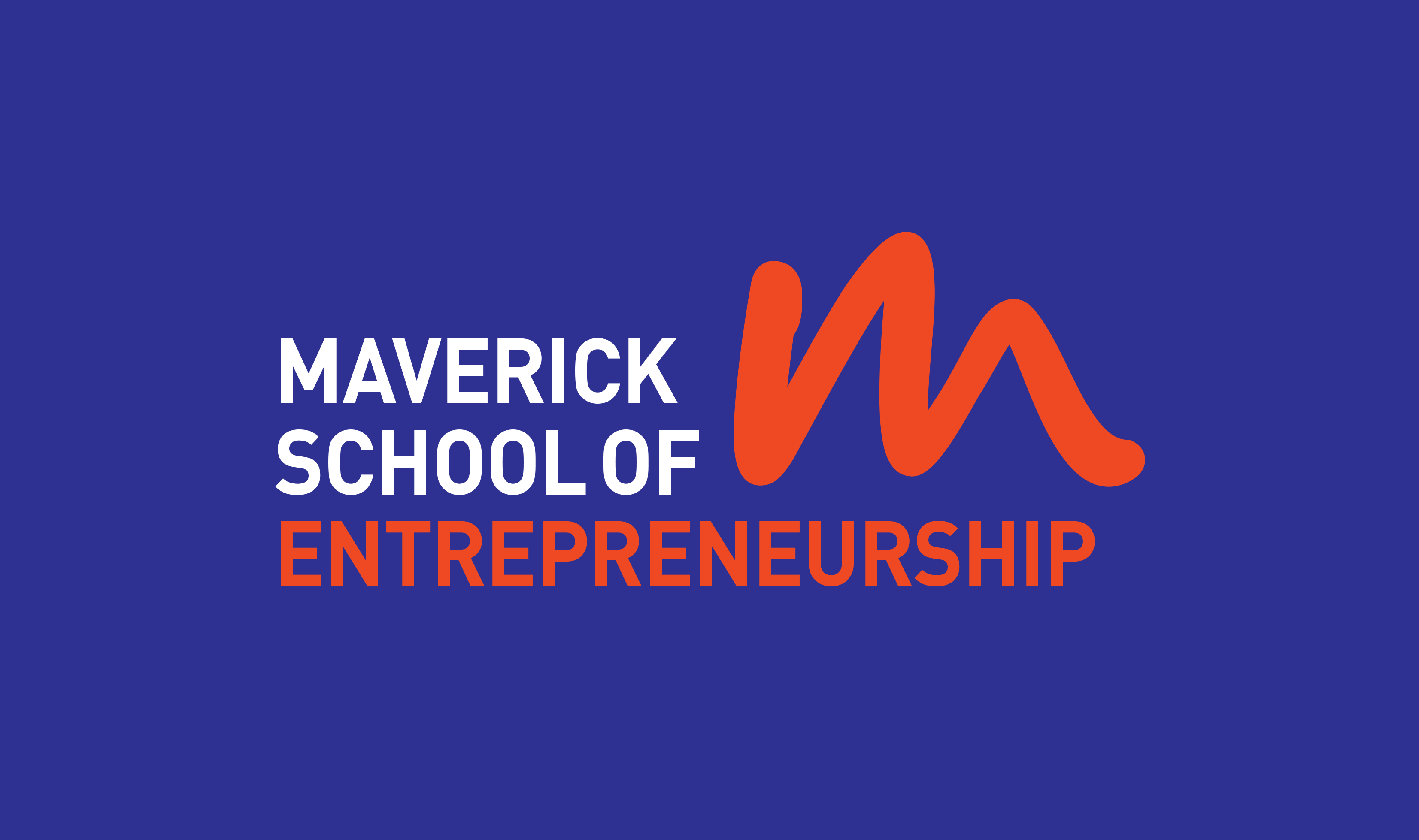
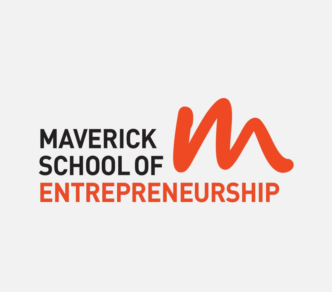
Brief: To create an identity and brand language for the Maverick School of Entrepreneurship that was founded with the purpose of bridging the gap between passion and prosperity, and bringing fulfilment through entrepreneurship instead of traditional careers.
Concept: The typographic logo with a hand-drawn ‘m’ monogram represents what the Maverick School stands for - inspiring people to be non-conformists by being true to what they are hard-wired to do, rather than following standardized paths society prescribes. The sense of movement in the ‘m’ symbolizes a free mind and that is not ‘boxed.’ The variable logo design allows for elements to be moved around, and colours to be played with. A bright and fun color palette has been used to appeal to a young target audience.