Please refresh website once, if it takes more time to load.

Scope: Logo Identity Design, Purpose, Positioning, Brand Language - Visual & Verbal, Website UI Design & Development


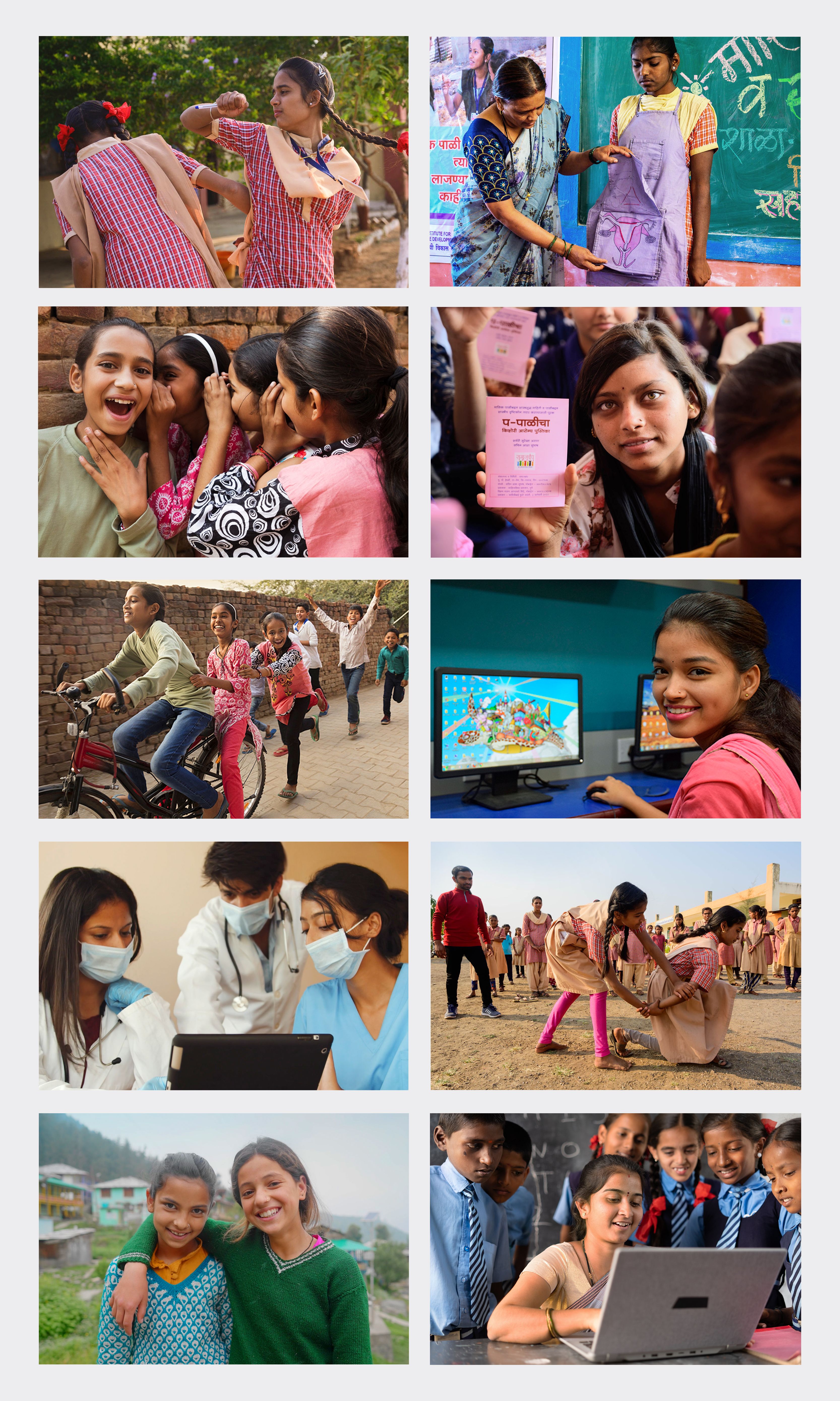
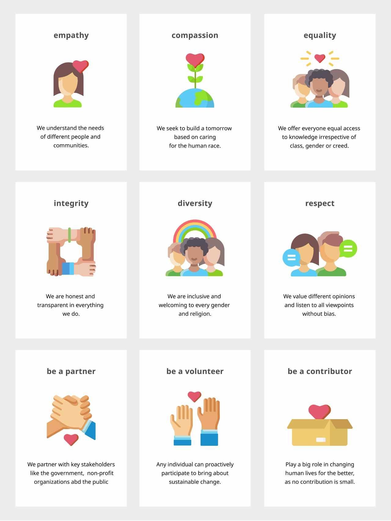
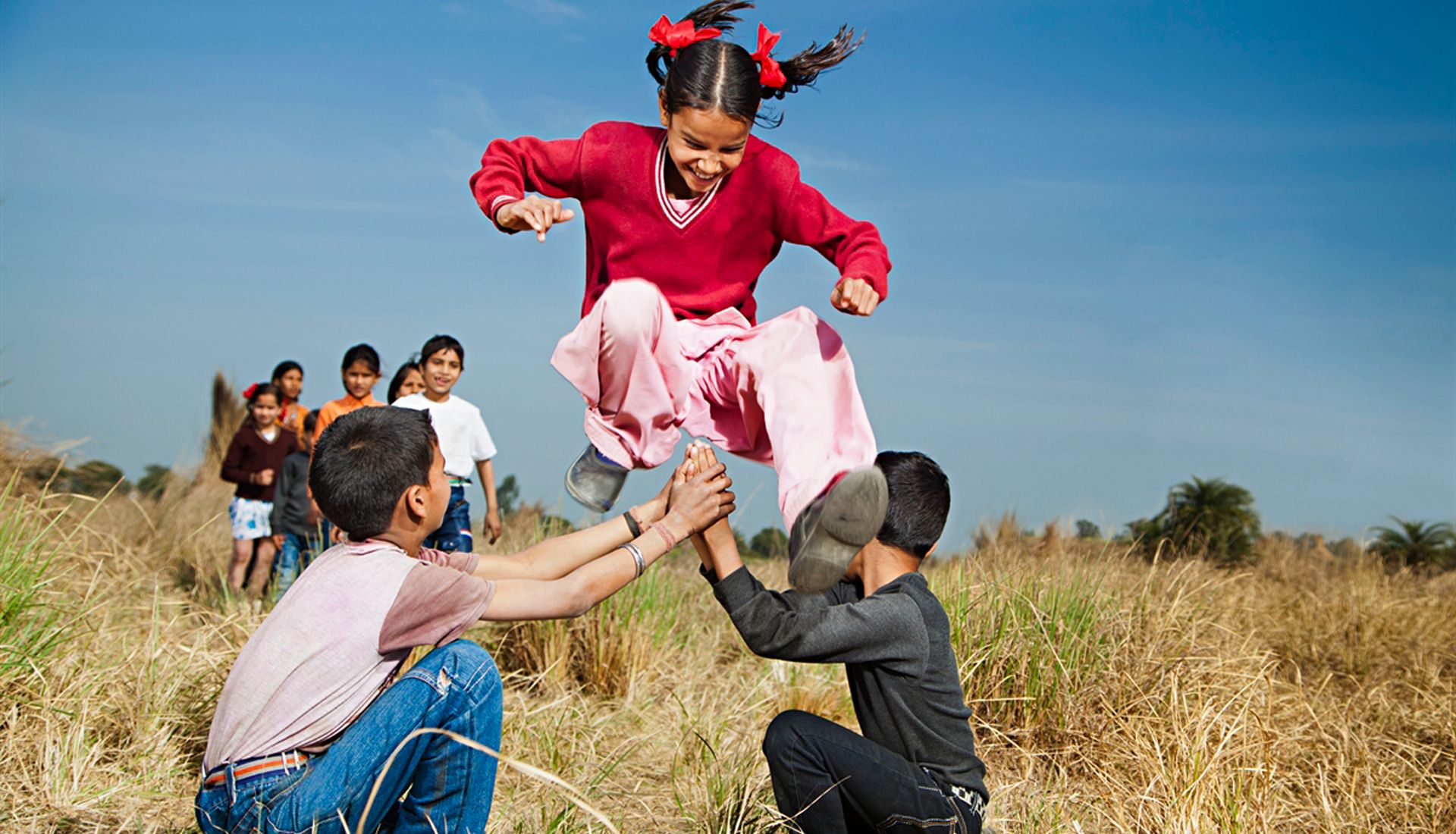
Concept/Approach - Communication Design & Website: he approach to creating the visual and verbal communication design is centred around the organization’s three pillars of educate, empower, encourage, and the hope for a better and brighter future for our communities. The use of a bright colour palette with hues of green and blue, and the vibrant imagery portrays strength, empowerment and happiness. The imagery shows a powerful impact within the community that is brought about by the organization’s transformational initiatives at the grassroot level. Most images show children and adolescent boys and girls in outdoor settings, which is symbolic of the freeing of the mind. The simple information architecture, clean custom user interface design, enable the user, who could be a partner NGO, a Government body or a potential contributor, to easily navigate the website and access relevant content.